Type: Art Direction
Role: Art Director / Designer
Engagement: Developed while at Al Tun Tun
Year: 2024
Role: Art Director / Designer
Engagement: Developed while at Al Tun Tun
Year: 2024
Al Tun Tun is a Los Angeles record label running weekly music events across the city's Latin scene.
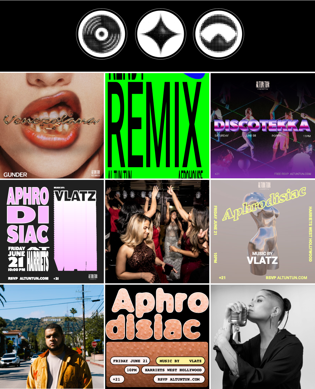
I led and designed the poster series that promoted them, built for the environment they actually live in: a feed, where the artwork gets one second to stop a thumb before it becomes the next thing scrolled past.
The Challenge:
A gig poster used to have a wall and a passerby. Nowadays that’s Instagram and a thumb already moving, so the label needed artwork strong enough to hold a room and fast enough to survive a scroll, week after week, for a different party every time.
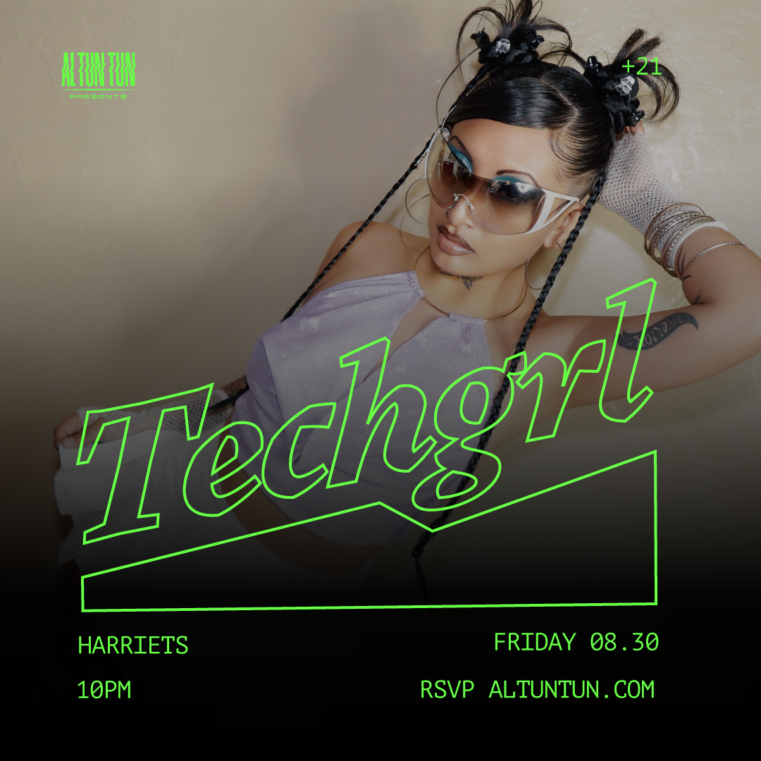
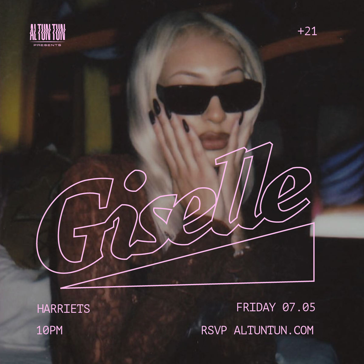
Aphrodisiac:
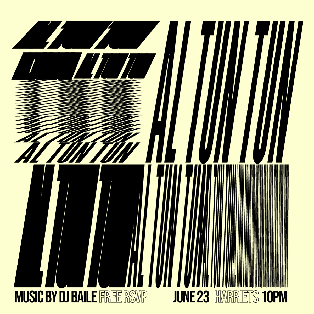
A weekly party hosting local Latin artists, and a platform for emerging talent in the LA scene. Weekly means the poster had to be recognizable as Aphrodisiac and new every time. The series carries a fixed visual signature with a different image behind it, so the party stays one thing across an entire run.
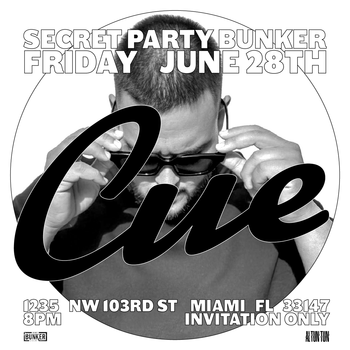
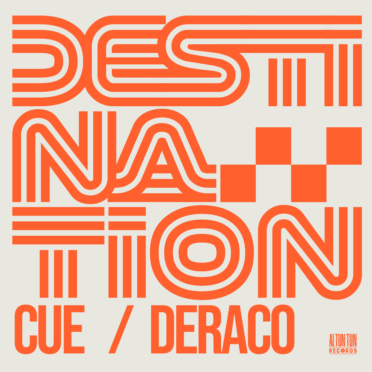
CUE:
A Miami-based Venezuelan artist who started touring after signing with ATT Records. I developed the touring visuals and art directed the promo for his 2024 U.S. tour, taking the poster language off Instagram and onto the road.
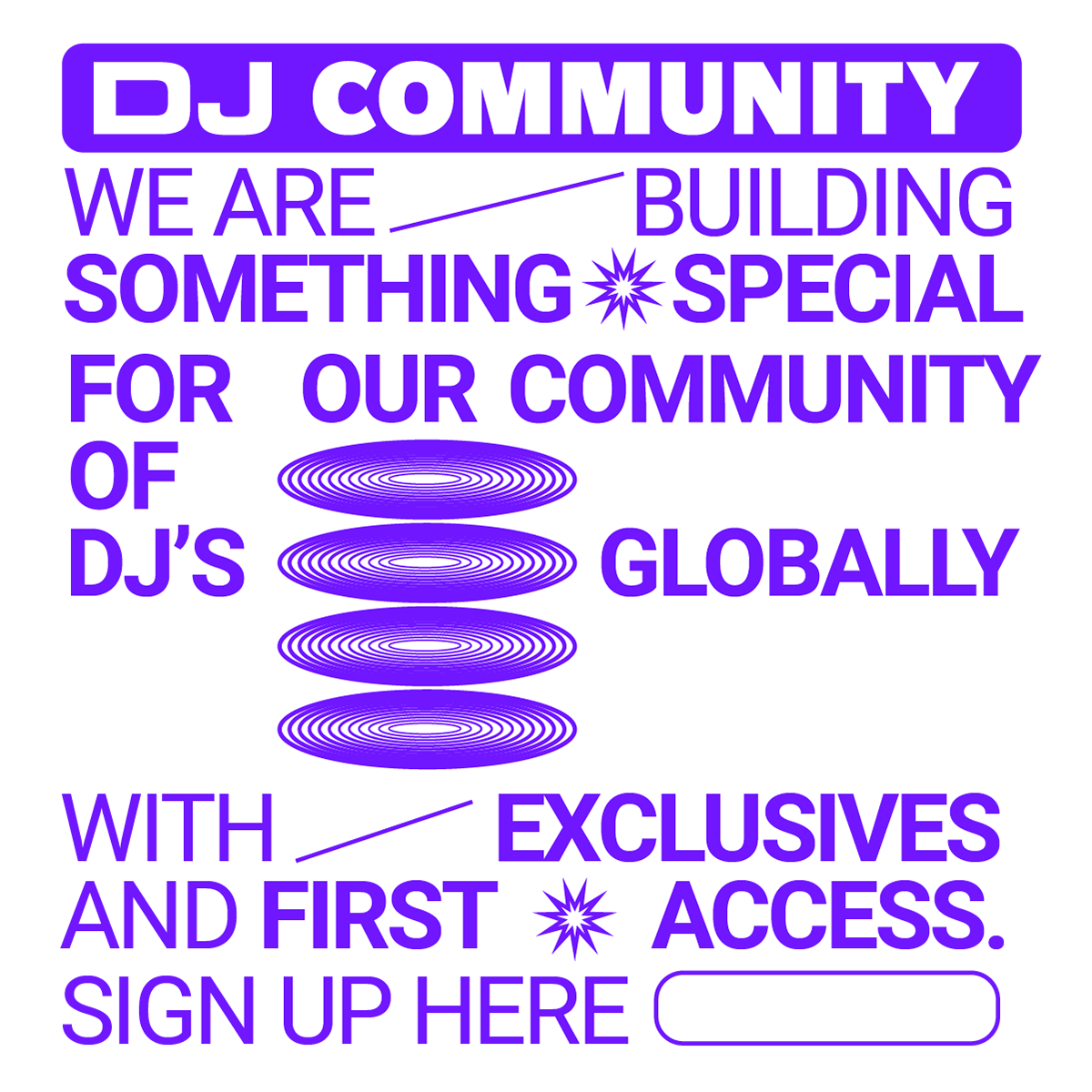
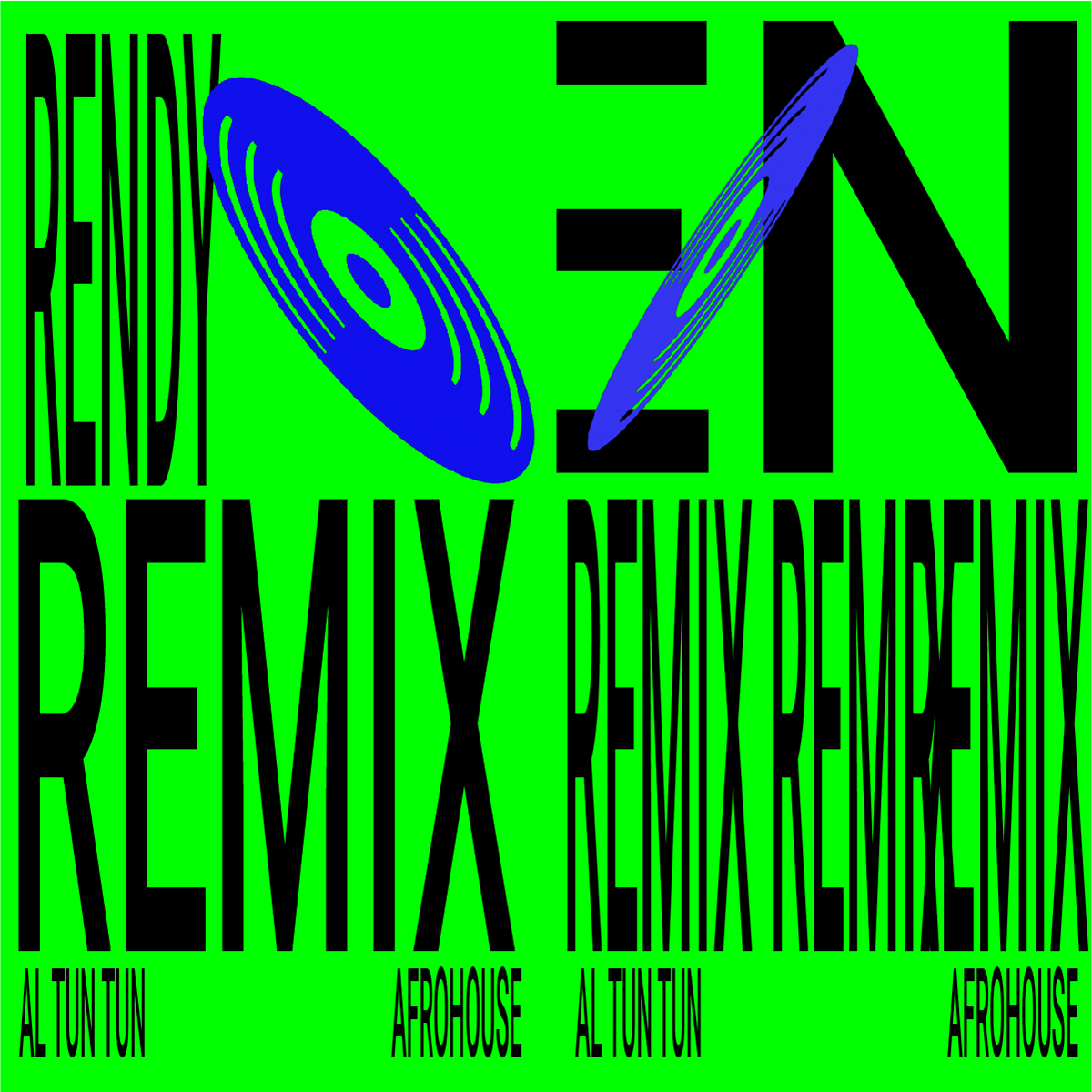
DJ Community:
An ATT initiative connecting Latin American DJs to the label's events, and to longer-term collaborations and recording deals. The visuals had to speak to artists, not audiences: an invitation to the roster, not a flyer for a night out.
Social Media:
Instagram was the campaign. Not a channel where the campaign also ran: the whole thing. Every piece was made to the feed's terms first, and everything physical came after.
What Was Achieved
Al Tun Tun was building a Latin music scene in Los Angeles across weekly parties, an artist roster and a DJ network. All of it competed for attention in the same place, against everything else on a phone, with no visual language to make the label recognizable from one week to the next.
How We Got There
I art directed the poster series as the campaign's main asset rather than its decoration. One visual language across parties, artists and initiatives, designed for the feed first and adapted to print, so every event read as Al Tun Tun before anyone read the lineup.
Challenges
The posters carried the label's promotion, week after week, across a full run of events. The visual language moved from weekly parties to an artist's U.S. tour without being rebuilt, and gave a young label a look the LA scene could recognize at scroll speed.