Type: Brand Identity / Visual Design
Role: Brand & Visual Designer
Engagement: Freelance Project. Commissioned by Knauwen
Year: 2023
Role: Brand & Visual Designer
Engagement: Freelance Project. Commissioned by Knauwen
Year: 2023
Knauwen is a Dutch street food brand serving traditional recipes for a contemporary audience.
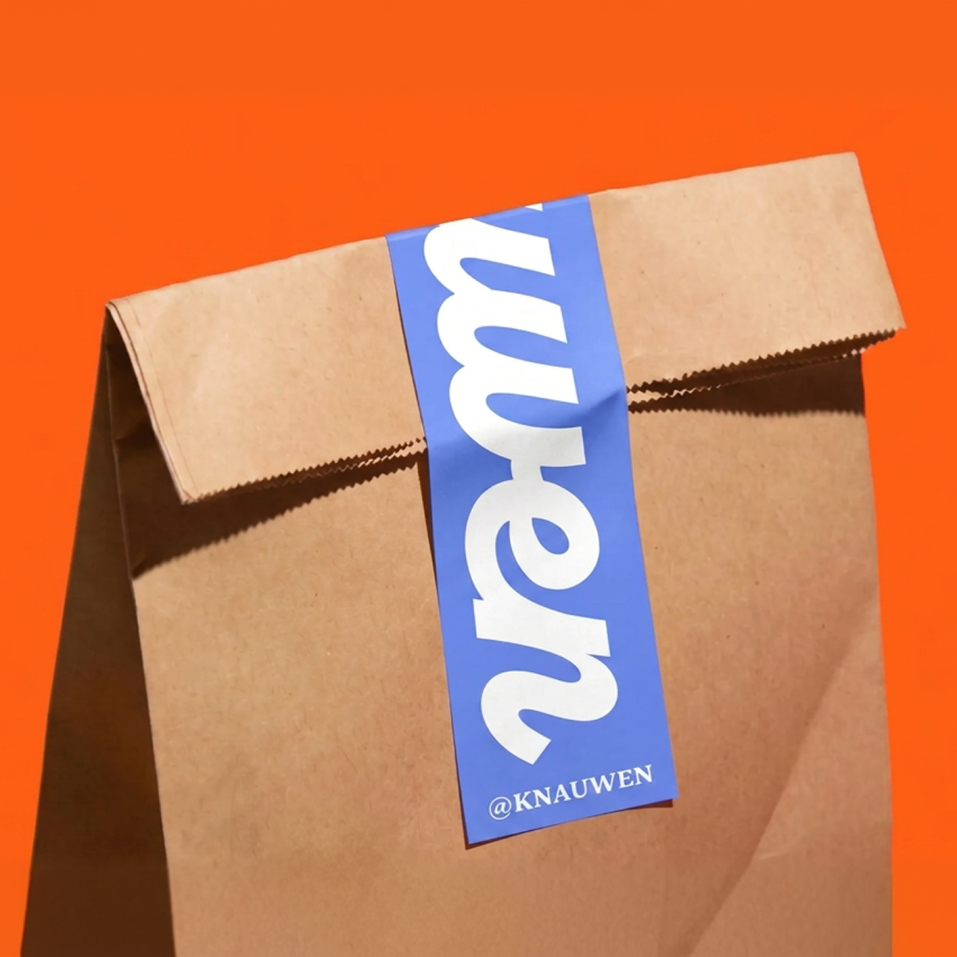
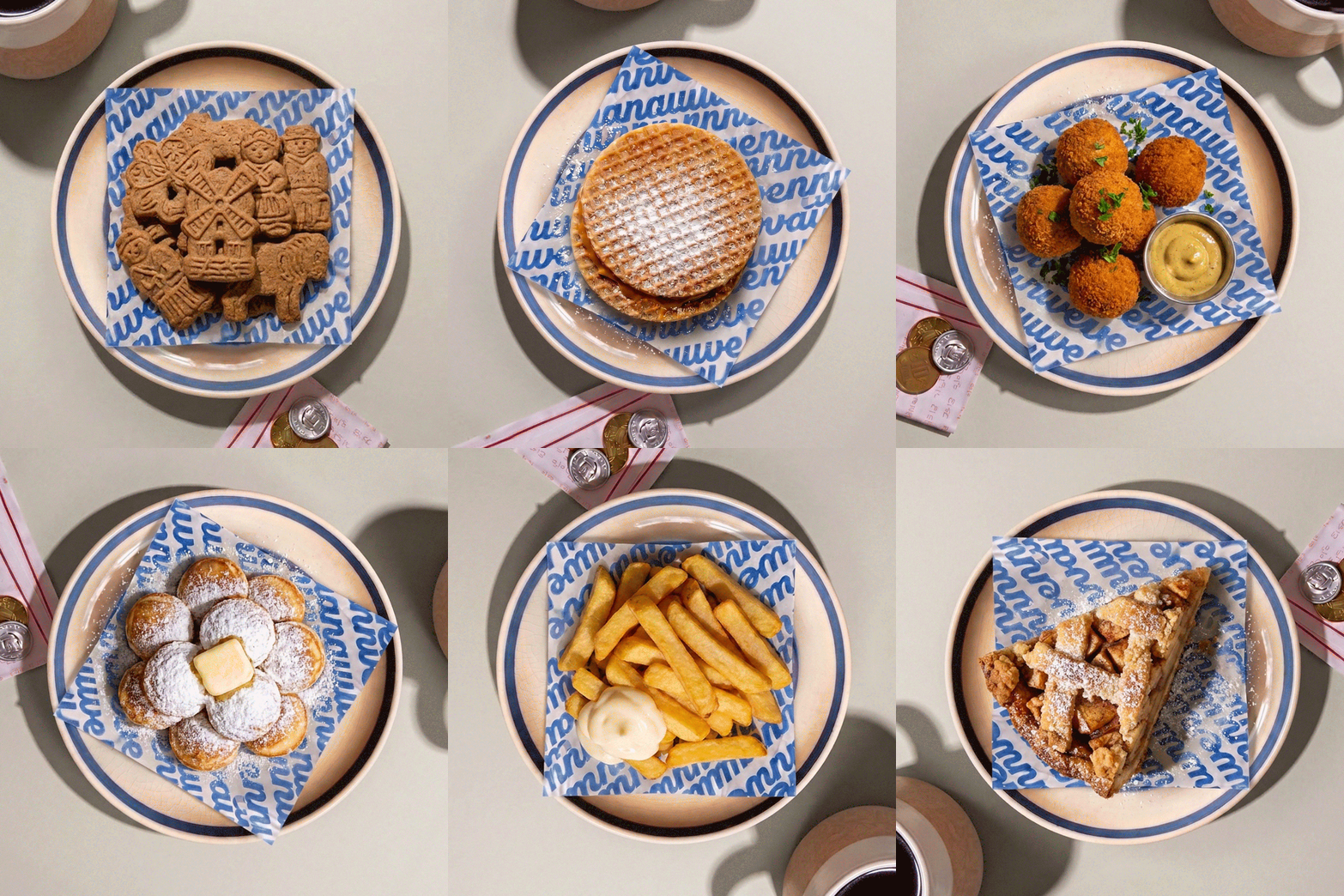
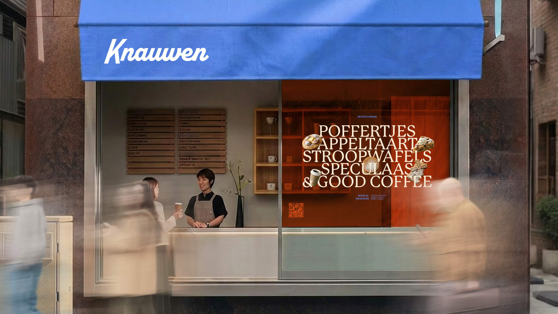
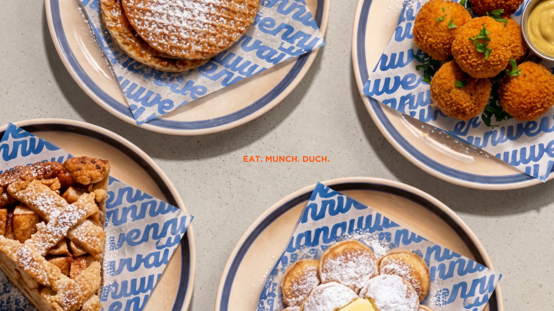
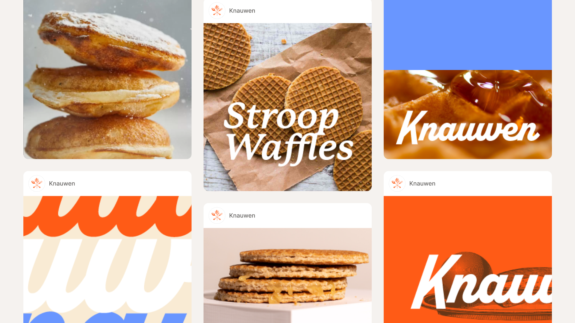
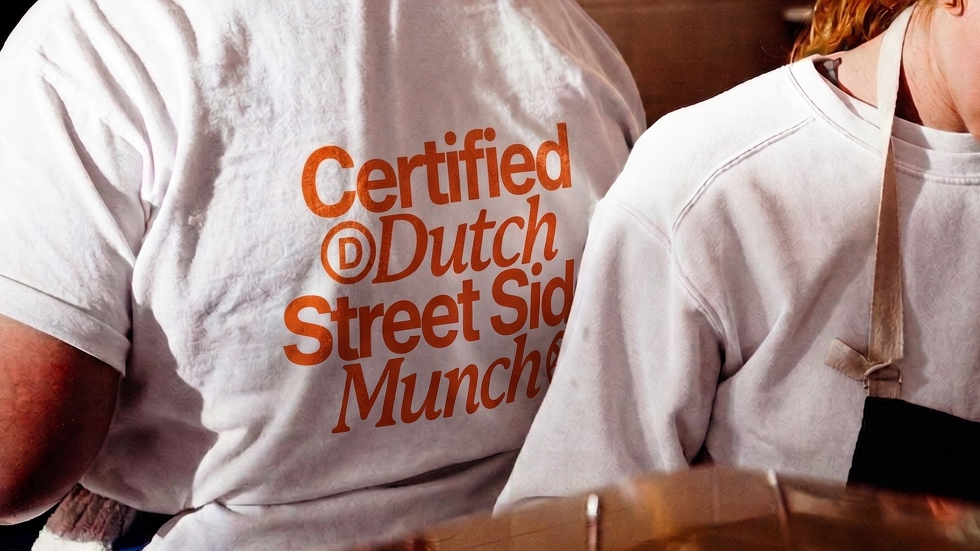
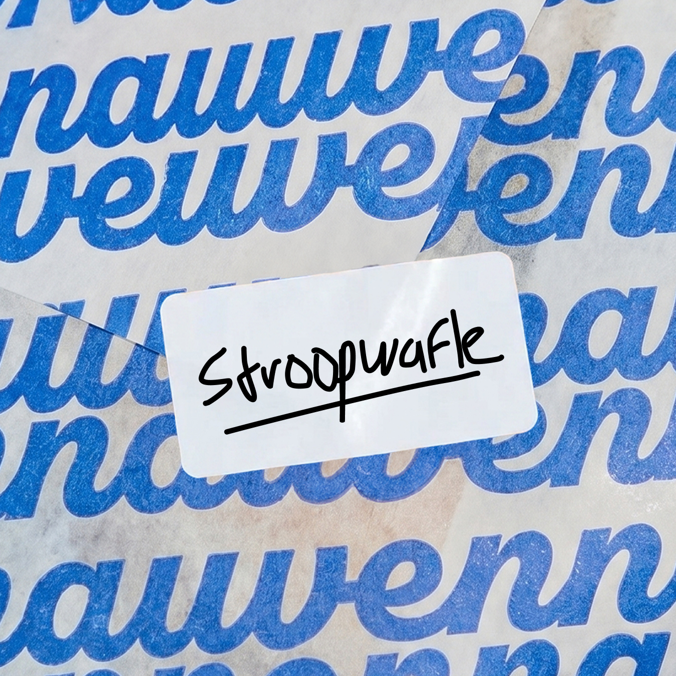
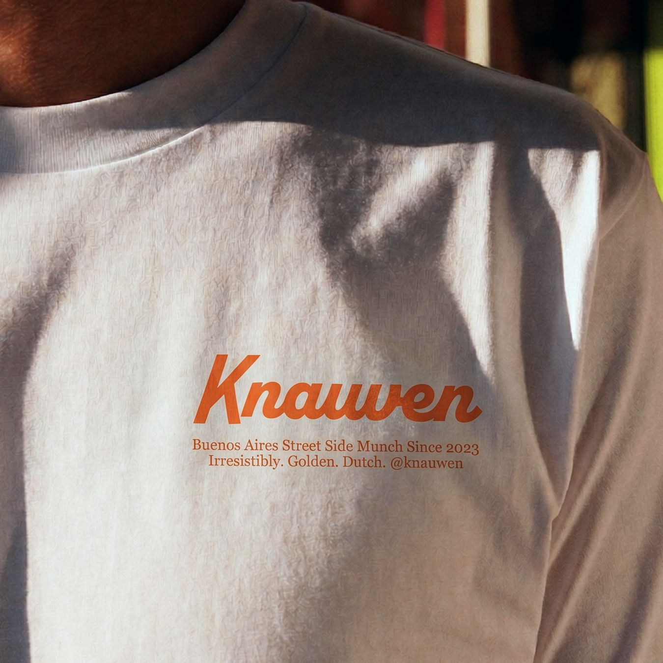
I developed the visual identity, building a crossover aesthetic that positions the brand as both authentic and current: the craft of a real kitchen, in a format you eat standing up.
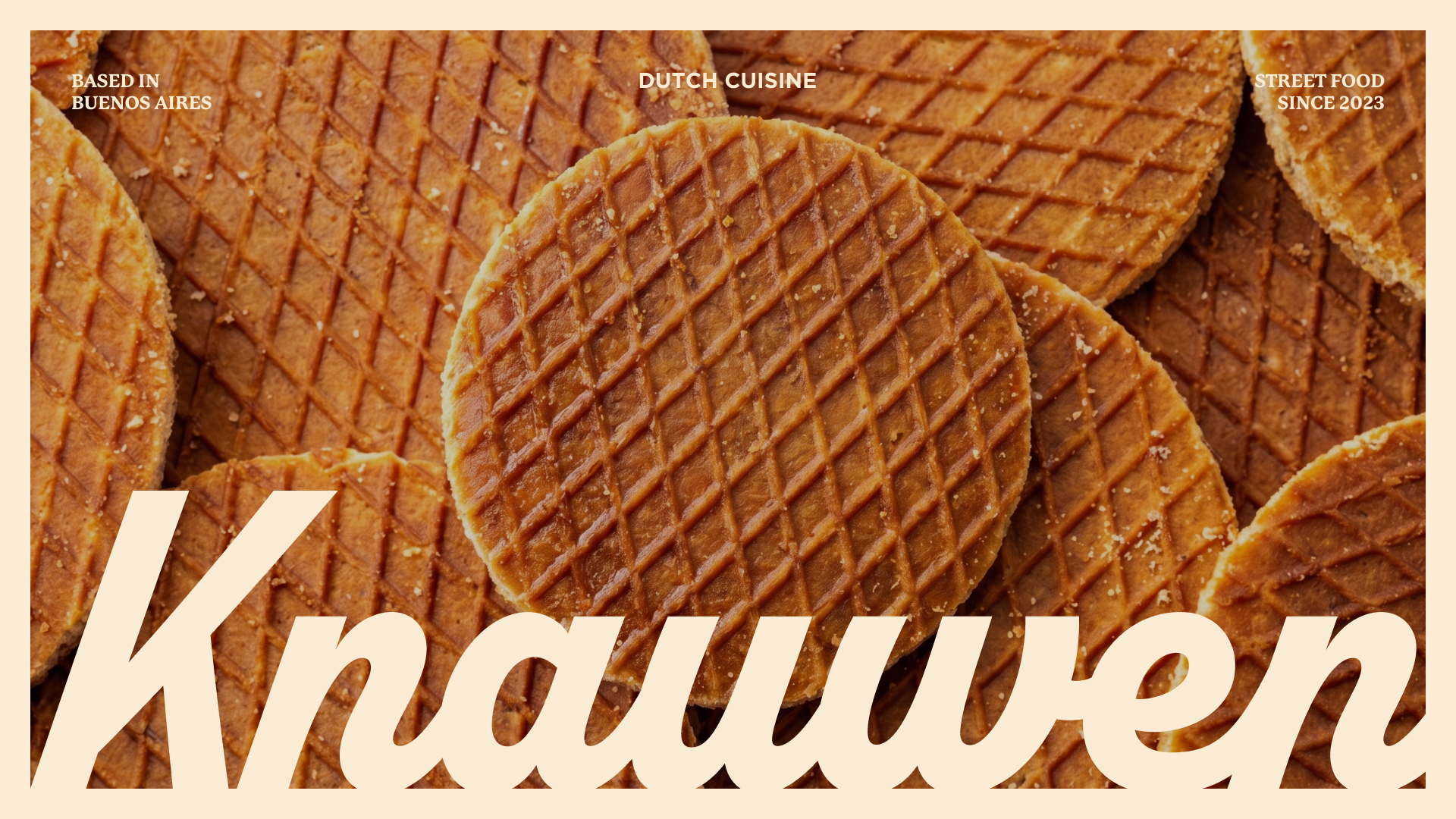
The Challenge:
Street food brands pick a side. They play rustic and hand-drawn, or they go clean and modern and lose the food. Knauwen needed both at once, and the category offered no model for it.
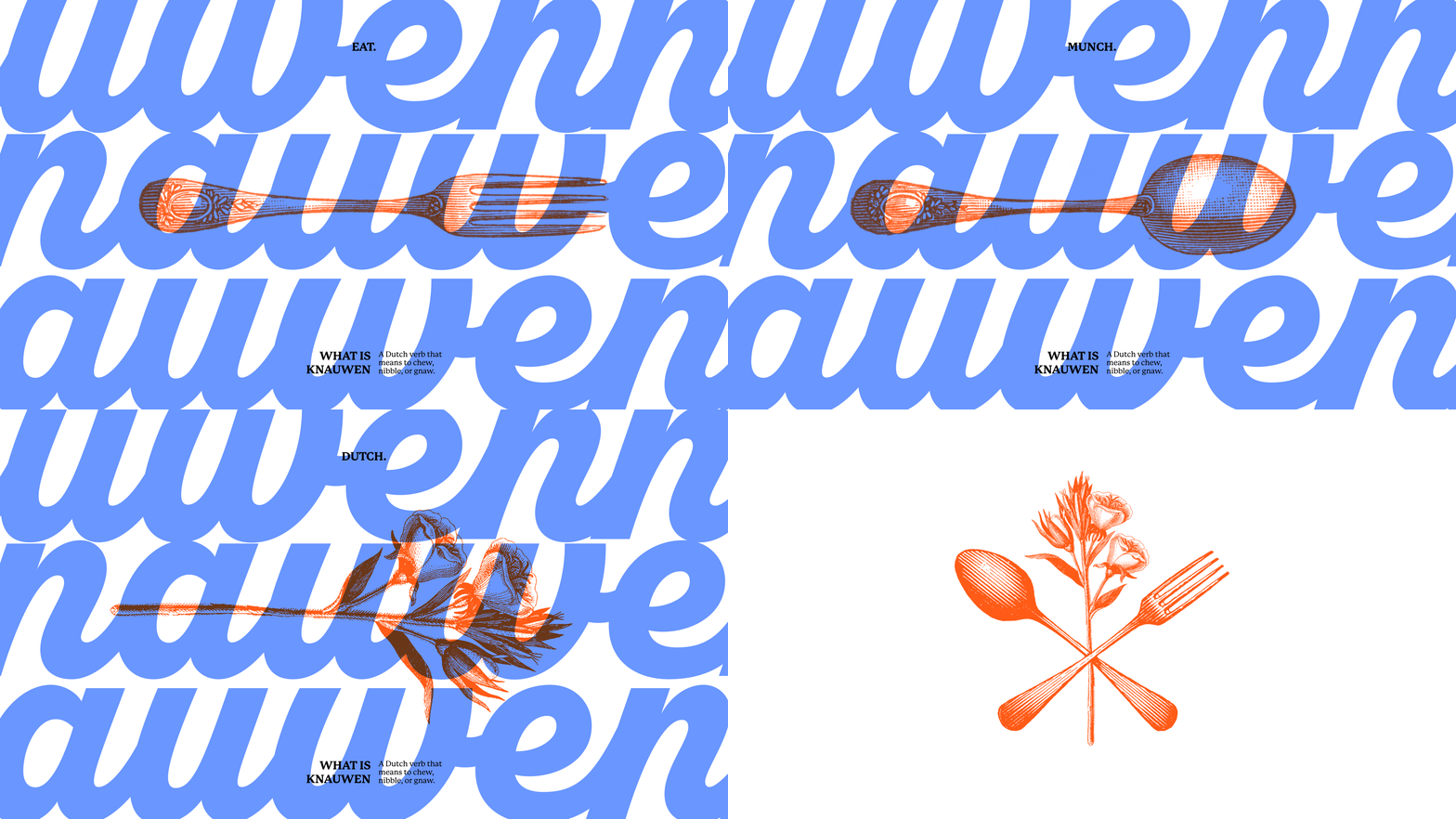
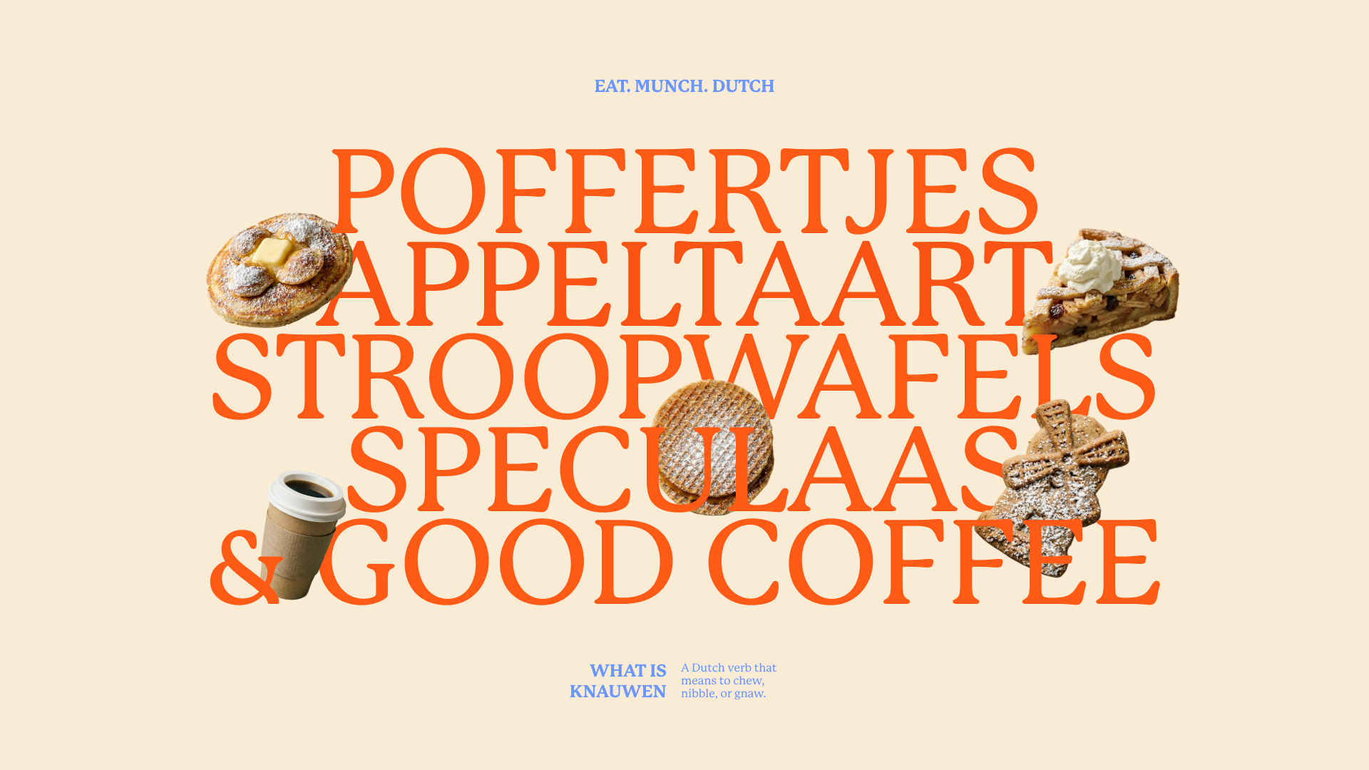
The Woodcut Library:
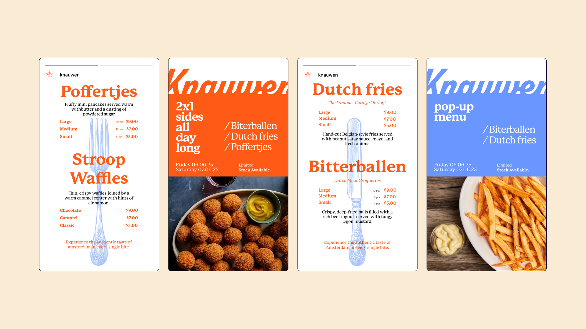
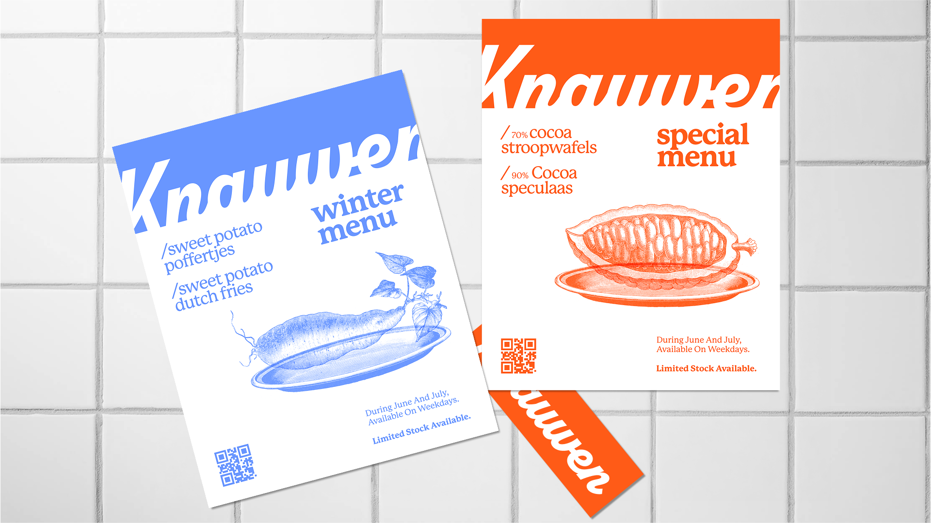
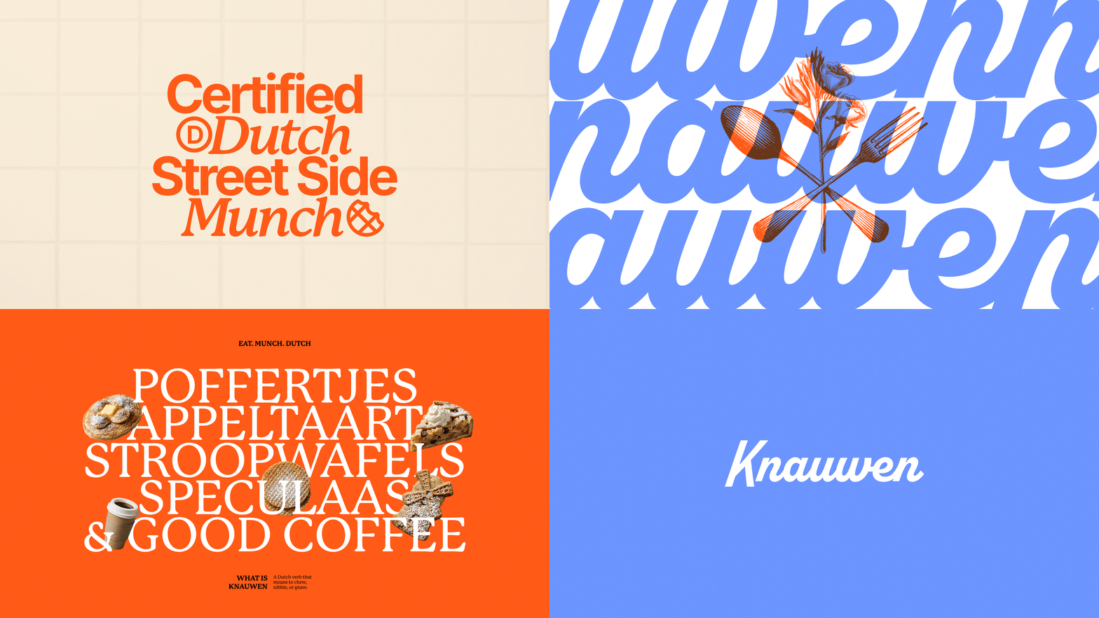
The illustration is woodcut, sourced from an open library. Engraving is native to Amsterdam: it is how the city and Dutch food have been pictured for centuries, and it carries that age without having to announce it. The open library also does something a commissioned illustrator cannot. It leaves the brand a catalogue deep enough to keep building pieces long after the identity ships, with no new drawing and no new invoice.
What Was Achieved
Knauwen's food came from a real culinary tradition, but the brand had nothing to communicate it. In a category that reads as either rustic or generic, the quality of the product was invisible before the first bite.
How We Got There
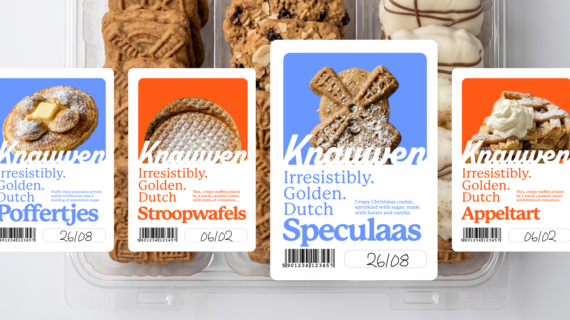
I built the identity around the tension the brand already lived in. Woodcut illustration carries the culinary roots and the age of the city; a bold, popular typographic tone carries the street. Both pull in opposite directions on purpose, across packaging, signage and menu.
Challenges
The identity gives Knauwen a position no one else in the category holds: high-end food that never pretends to be a restaurant. And it keeps producing. The open illustration library means the system can grow into new pieces without going back to a designer for every one.